I can’t stop thinking about that damned cover. I don’t like it, but I don’t know exactly why. It’s ballsy, and it doesn’t particularly offend me, but the very first time I saw it my reaction was “Not OK”.
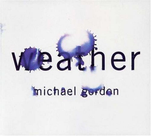
The cover was designed by Barbara deWilde, who has done some wonderful work for Nonesuch in the past. Her work often conveys meaning with a certain bluntness or literalness, which is one of the pleasing things about it. My favorite is her design for Michael Gordon’s Weather:
If you’ve ever talked to Steve, or heard him speak (much less listened to the man’s music), you may agree that he can be similarly direct, often to the point of bluntness. I don’t have any “inside information” on how this cover came about, but I can imagine it appealing to him. As in: let’s not just use a photo of the twin towers, let’s use one of the most visceral, gristly, in-your-face photos that exists—the one where the plane is an instant away from the second tower.
Anyway, they’ve already given 9/11 the dreamy-and-elegiac treatment, with this beautiful cover by John Gall:
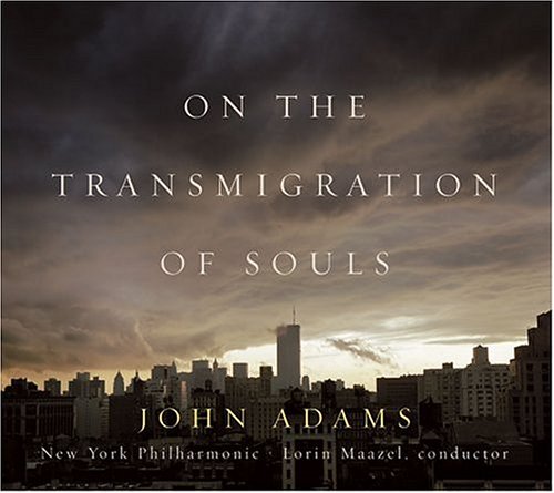
Interestingly, while the WTC 9/11 photograph may have incited controversy, the typography is utterly appropriate: the titles are set in Gotham, the same font used by the 9/11 Memorial, the Freedom Tower’s cornerstone, and on and on ad infinitum (including, umm, this here cover).
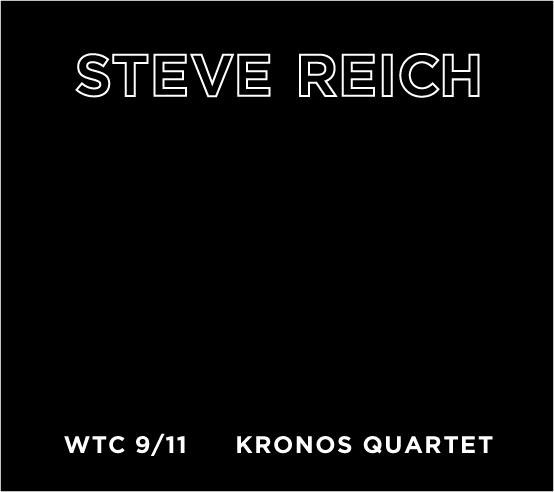
So, if you don’t want that photo in your iTunes library, but you enjoy Gotham, then here, I made something for you:
UPDATE, 7/29/11: Bob Hurwitz has a typically eloquent response.
hey timo,
the problem as i see it is a question of ownership. tragedies that involve other people should only be addressed tangentially, in my opinion; otherwise you run the risk of saying not “this is what this means to me”, but “this is what this means”, i.e. asserting ownership over the story. music, even music with text, is by nature tangential — it’s always at least partially in the realm of the implicit; content and form are generally indistinguishable and a lot of the ‘meaning’ is in the ear of the listener. so, to attach such an explicit image to this piece just feels cheap to me, reductive. obviously 9/11 means a lot of different things to different people. we don’t want to be told how to feel about it, we’re just interested in how Reich has personally received it.
I agree with you on all counts, and I think you’ve gone a step further in explaining the existence of this cover. I think Steve probably does feel that he has “ownership” of such an image. Listen to this soundcheck interview to hear him explain. (NOT A PLUG, but I remember because I was on the second half of that show)
Again, this feels very much like a “Steve” decision rather than a “Nonesuch” decision, but I don’t know for certain how it went down.
Referred to you by slate. Actually I think the original cover is above all, just plain cheesy in a weird way. I actually think your version looks really nice, appropriate. Thanks for the public design example.
I think the all black is more interesting… or perhaps even a silhouette of the twin towers (with no plane). The actual cover is very unsubtle.
I took your cue and thought it *needed* to have a cover, perhaps something like this:
http://www.flickr.com/photos/27777116@N06/5970444413/
…based on this CC photo:
http://www.flickr.com/photos/testspiel/347810662/
…just hope this doesn’t start a new meme.
the black cover is beautiful, as is your upward gazing version, LR. i am a sound artist, as well as the inventor of a textile (sonic fabric) that’ woven from recorded audiocassette tape. my alternative solution to the WTC 9/11 cover dilemma was to record mr. reich’s music onto the tape prior to weaving, to create a plain black cover that is actually imbued with the work contained on the album. clearly not happening – but fun to think about anyway. :) i certainly would be delighted to work with any fellow artist/musician interested in having some custom-recorded fabric woven for use in your own projects…